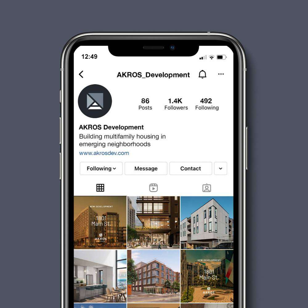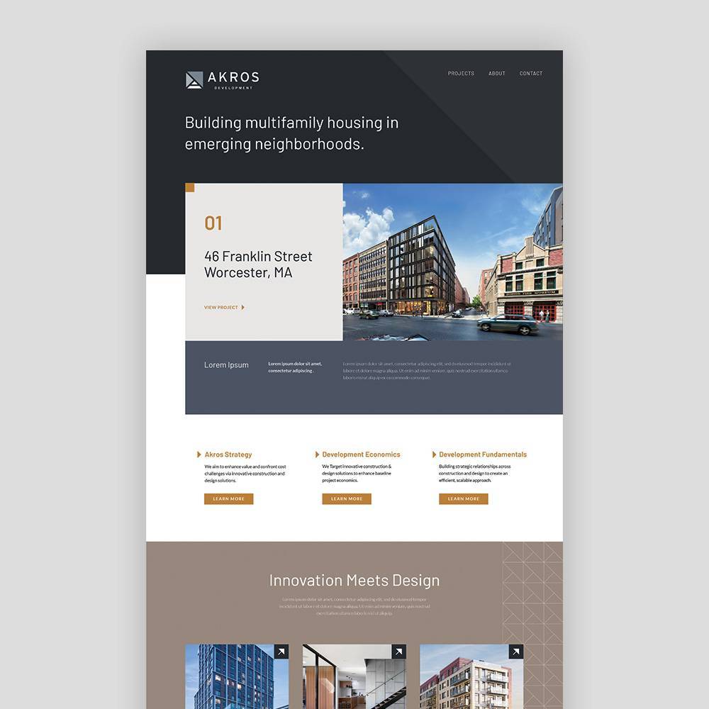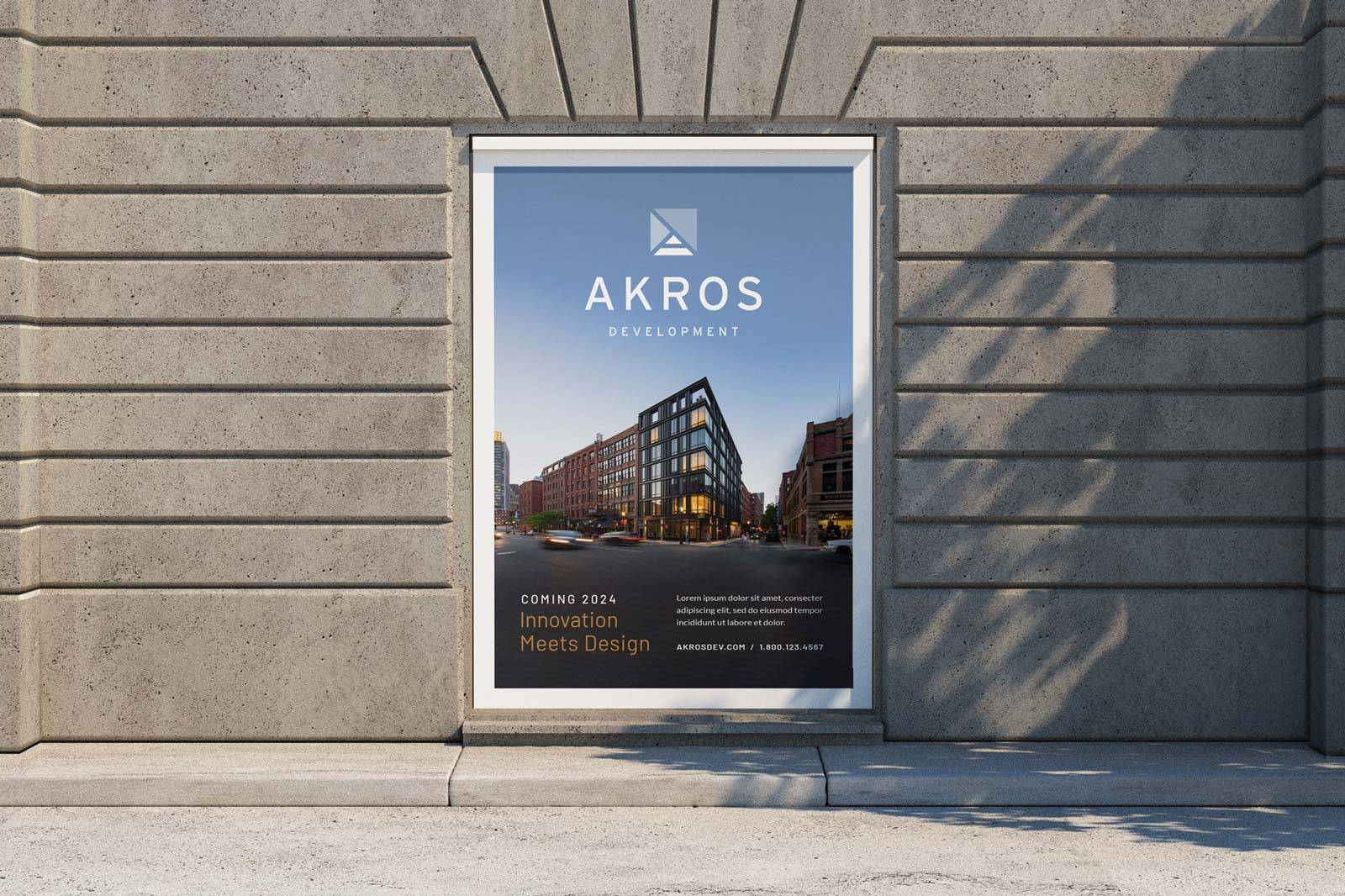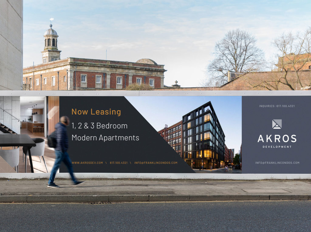
Doodle + Code created the logo, brand identity and various marketing materials for Akros Development, a real estate development firm that focuses on building multifamily housing in emerging neighborhoods around the Greater Boston area.
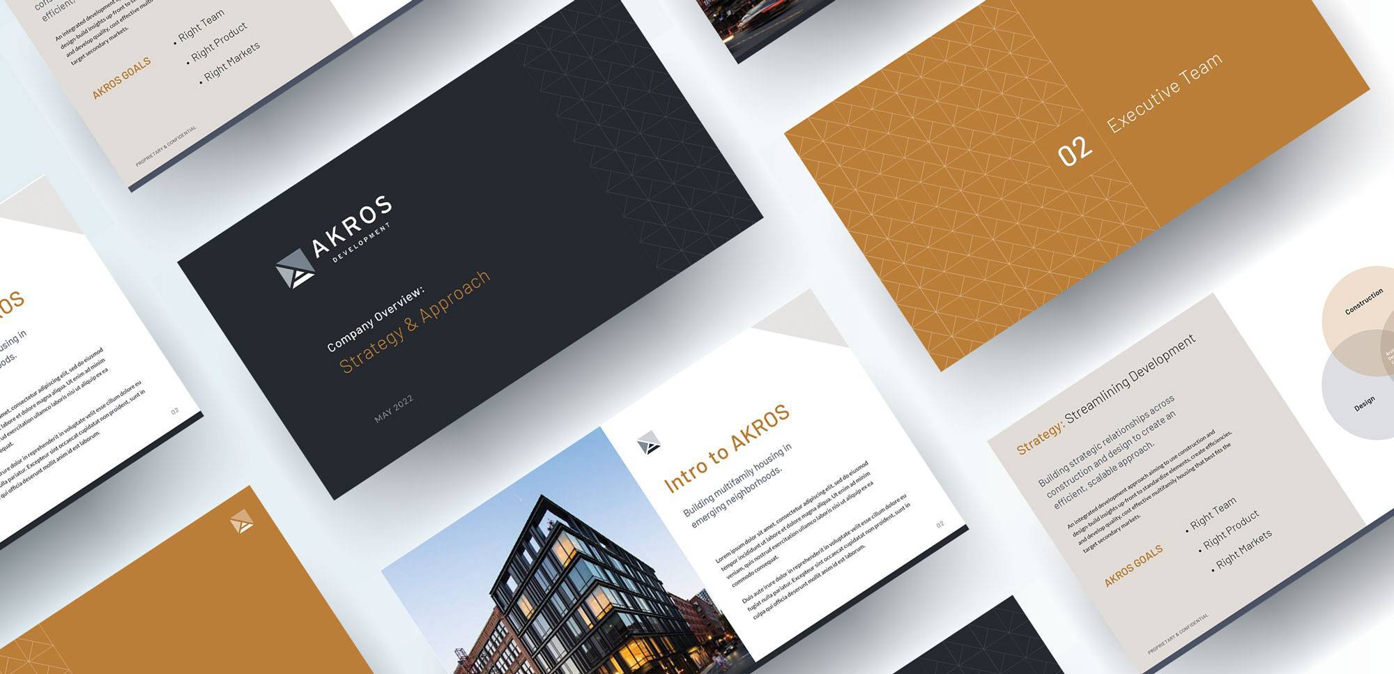
Our Role
Branding/Identity
Print Collateral
Interface Design
Signage
Marketing Material
Concept/Content Strategy
Social Media
Graphic Design
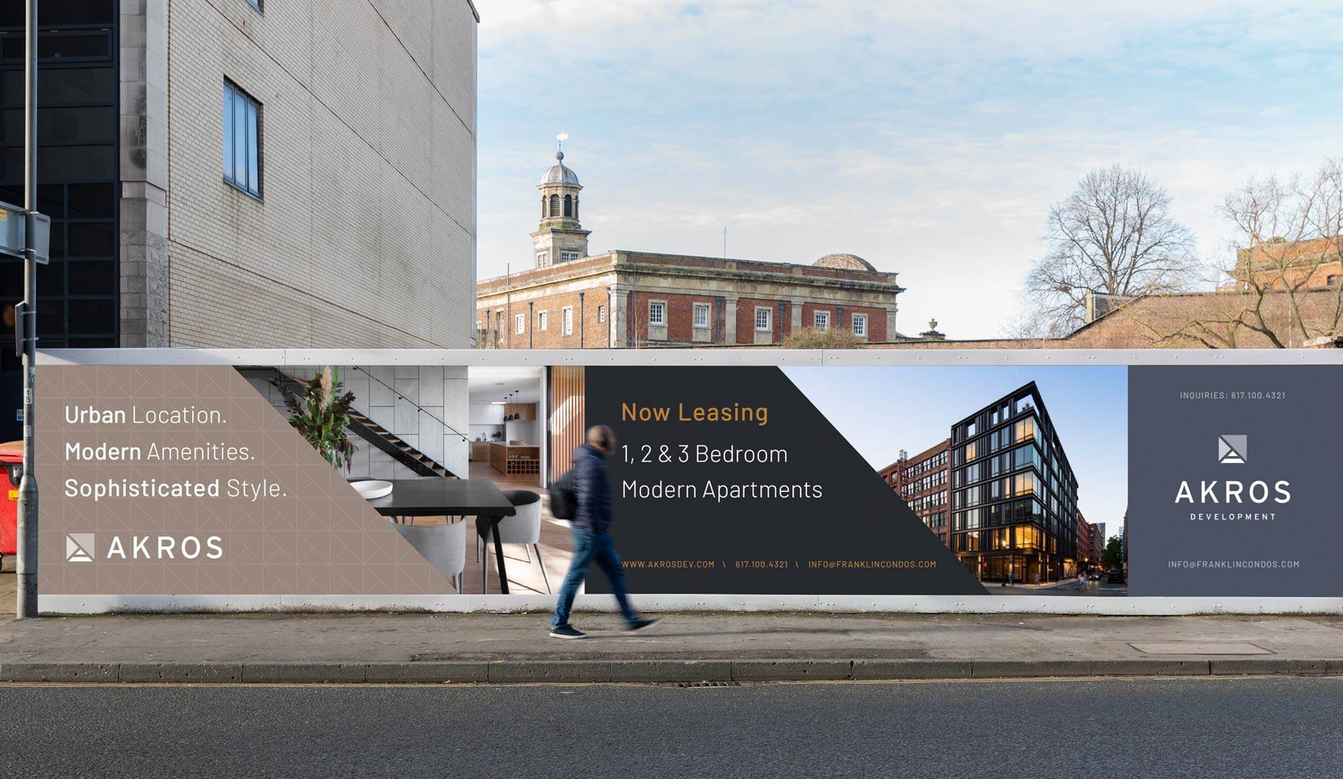
Building a Palette
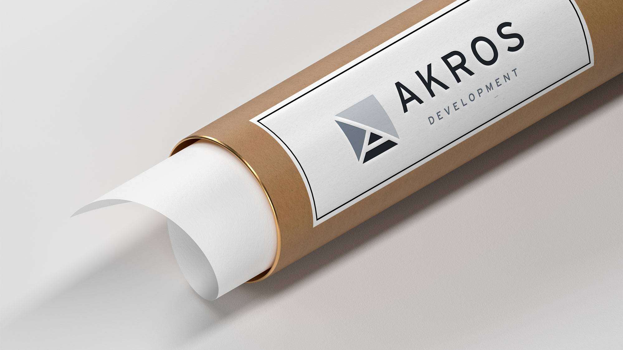
The color palette is inspired from the colors found in building elements such as steel, concrete and brick, providing the identity with both cold/formal tones and warm/welcoming ones.
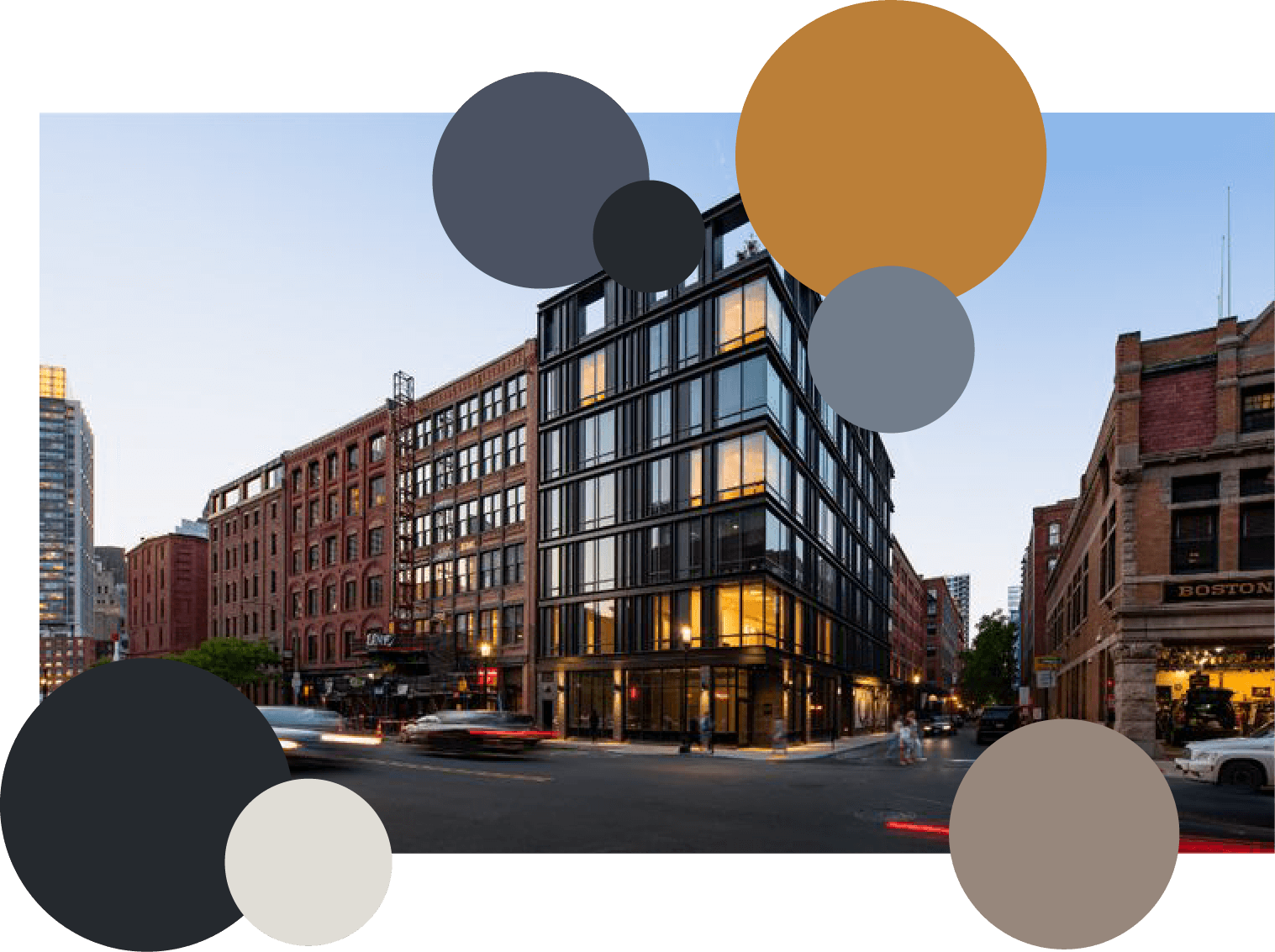
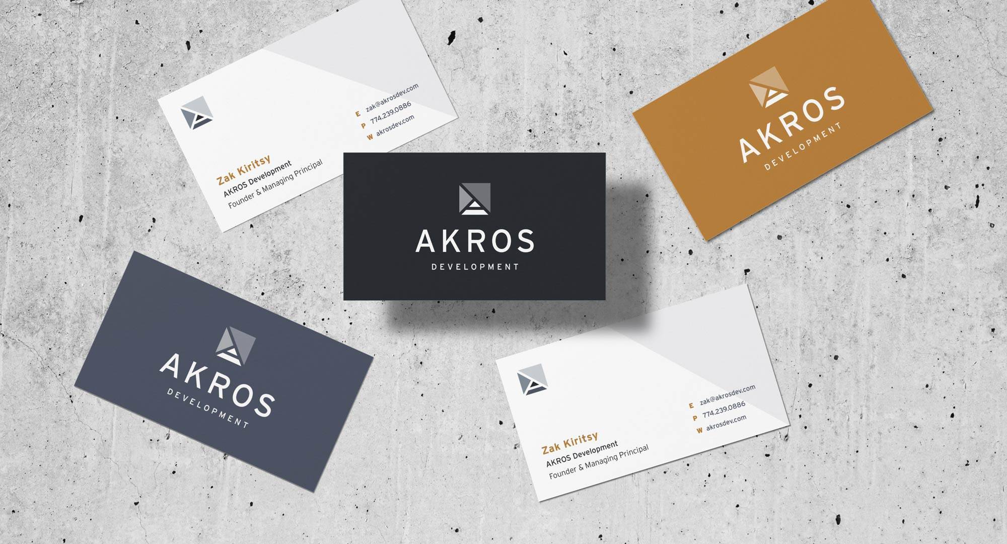
A Story within an Icon
The design of the logo was inspired by the combination of the name “Akros”, meaning “top-most”, and the core values of the company – Forward-thinking, emerging, transformative, and sophisticated, with a nod to keep things simple and precise. The Icon is made up of several symbols who’s connotations all contribute to the meaning of the brand as a whole.
The strongest visual emphasis lies on the “Peak” symbol, which represents “top-most” as the main brand message. This peak also forms the letter “A” for Akros in its negative space. The forward and upward arrows that make up the rest of the icon represent the forward-thinking and transformative values of the company and are used throughout the identity to create patterns and complementary assets as well.
