The D+C studio tackled a refresh of HB Construction’s brand identity. Since HB Construction has an established brand identity with equity in their name and reputation, the rebrand needed to retain some of the original brand aesthetic for recognition, while bringing a more contemporary feel to the mark and addressing some of the visual problems they were experiencing with the original design.
D+C refined HB Construction’s current mark by designing a more legible and bold aesthetic, presenting HB as a more forward-thinking and modern organization while retaining its original brand reputation.
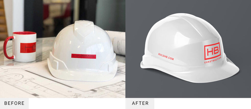
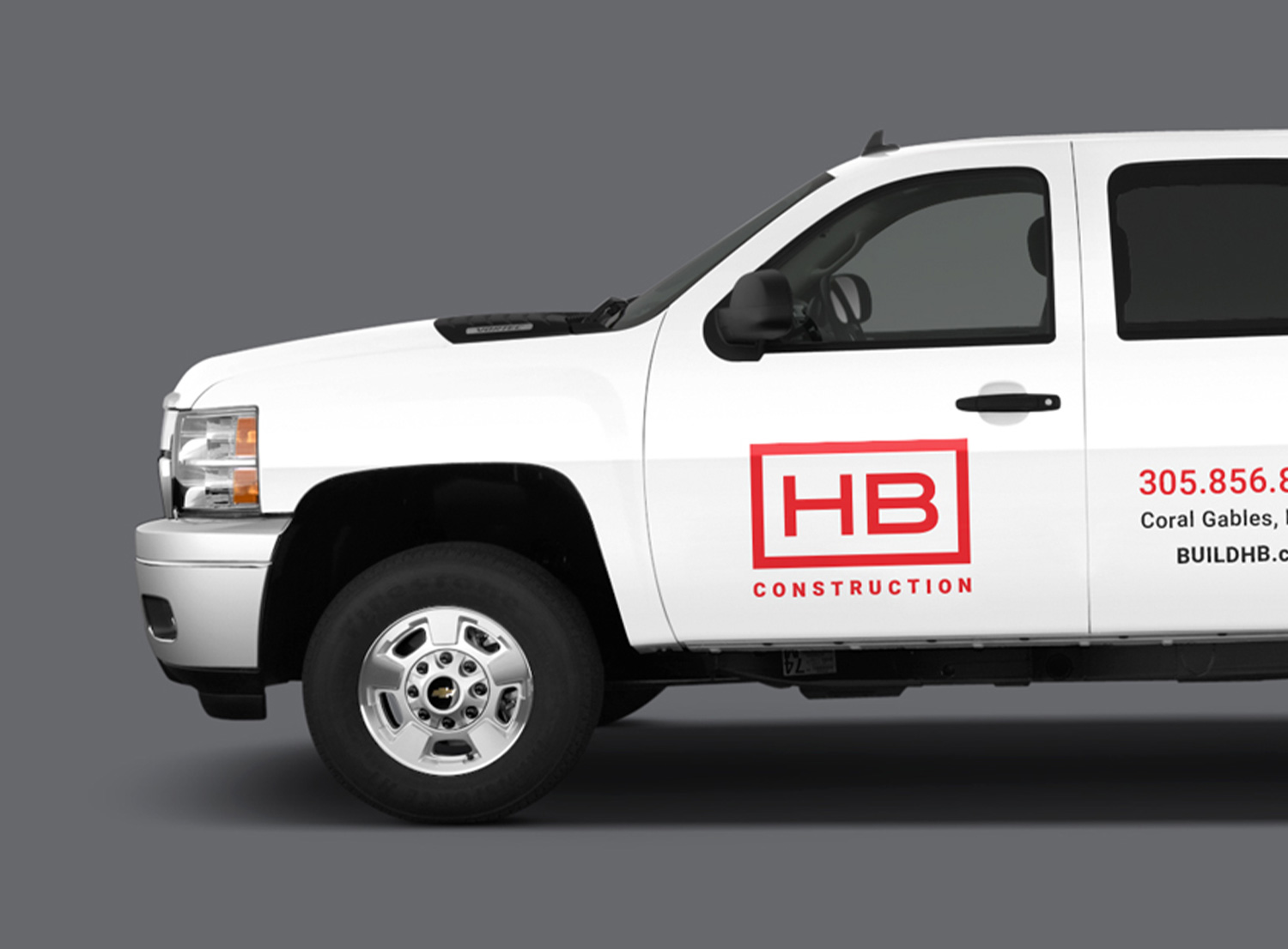
The new logo was designed with a much thicker stroke so that it can be more easily read and recognized from a distance or when used in a smaller scale. The new branding uses the same color palette of red and black for brand recognition, but without having black overlayed on red in order to avoid legibility issues. D+C also updated the word “construction” to a more vertical typeface, allowing the letters to be larger in the same amount of space and therefore more legible when scaled down.
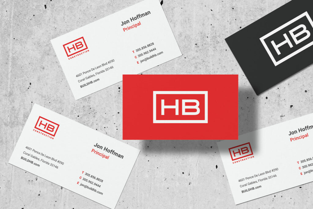
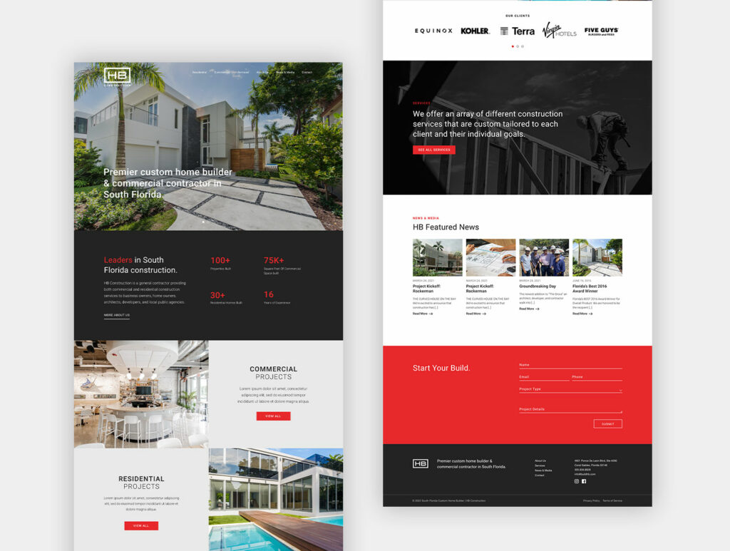
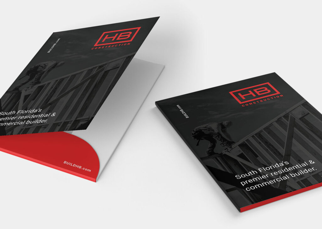
Creative decisions used in the logo, from color usage to typography, were used across the entire branding package to create a fully refreshed and sophisticated brand aesthetic. The new branding as a whole provides a more bold, reliable and contemporary feel to a well established company.