In our latest project spotlight, we’re thrilled to share the collaboration between Doodle + Code and Core Concepts Architecture, a boutique firm renowned for its innovative approach to architectural and interior design, space planning, renovation, and construction administration across residential and commercial projects. Our journey with Core Concepts Architecture was centered on crafting a brand identity that not only resonates with its ethos but also stands the test of time in its design and appeal.
Crafting Timelessness and Elegance
The challenge was to design a logo and brand identity that would serve as a beacon of innovation and creativity for the firm. We aimed for a clean and timeless mark, steering clear of the transient and embracing the eternal. Our color palette choice was deliberately simple and sophisticated, ensuring that the brand’s visual language would resonate across various mediums and stand out in the crowded marketplace of architectural firms.
A Logo That Speaks Volumes
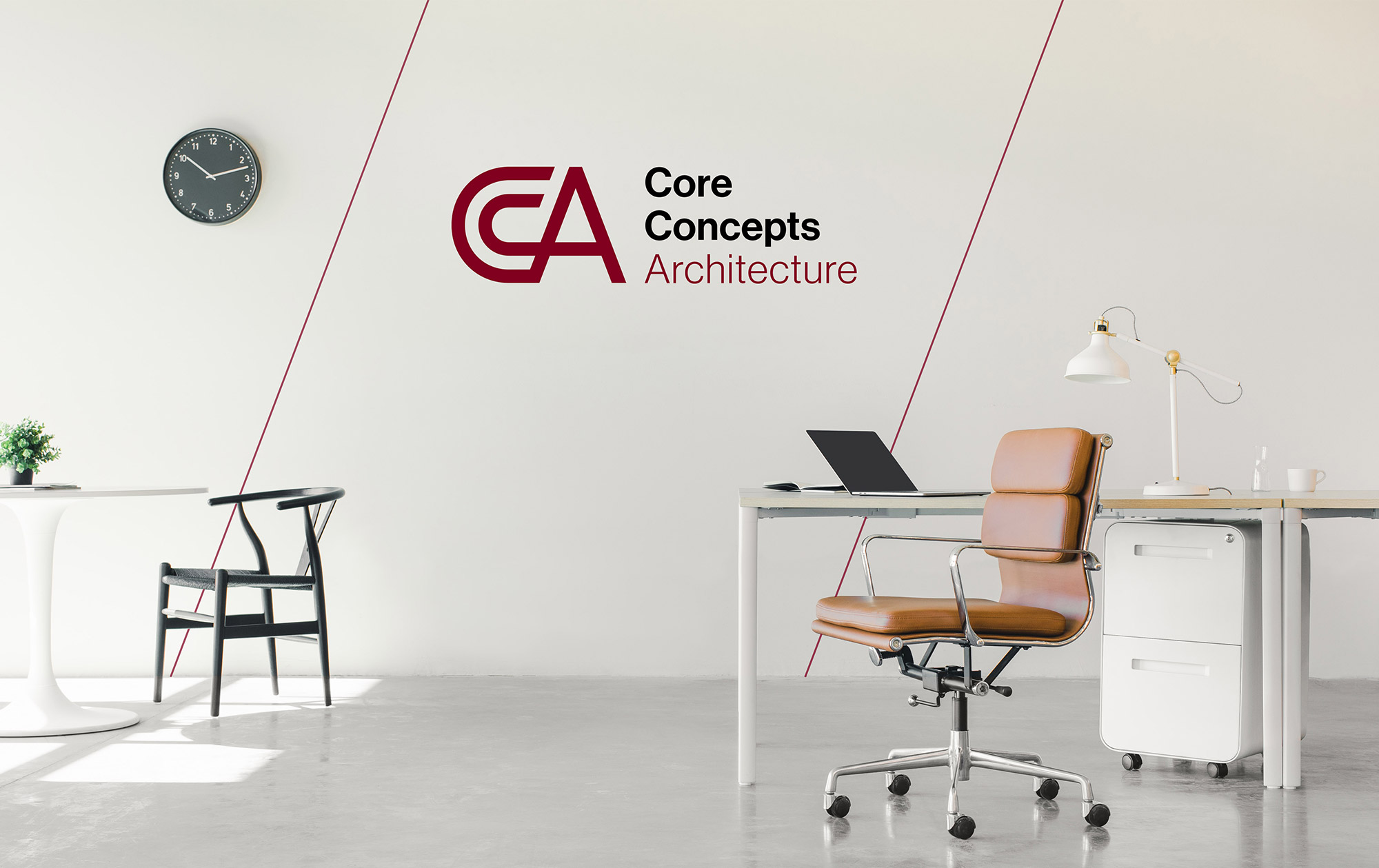
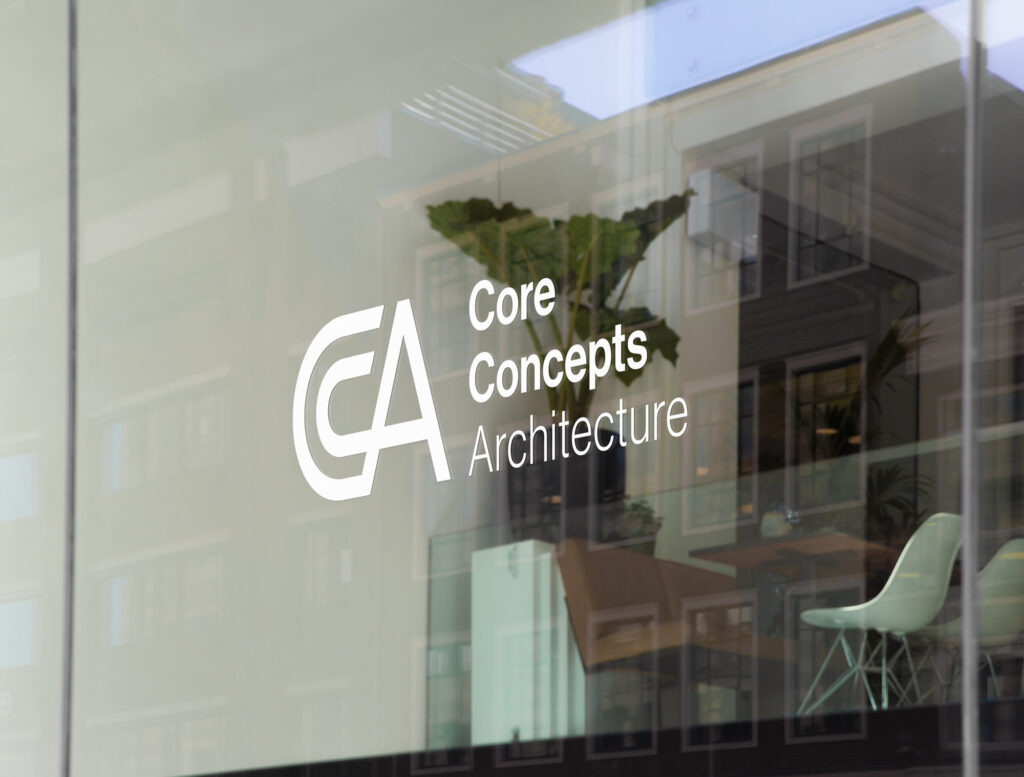
The logo for Core Concepts Architecture is the cornerstone of our branding strategy. Designed with precision and purpose, the logo aims to embody a typographic and unified mark around their acronym, CCA, that is both modern and timeless. It’s a visual representation of the firm’s core values and its commitment to creating spaces that blend functionality with aesthetics.
The icon ingeniously plays off the word “Core,” with the C’s of Core Concepts nestled within each other, symbolizing the interconnectivity and foundational strength of their design philosophy. This unity is further emphasized through the careful balance of negative and positive spaces, along with clean angles that culminate in a visually unified and balanced icon. The logo’s design is a testament to the firm’s innovative approach and its dedication to creating spaces that inspire and transform.
Beyond the Logo: A Unified Brand Identity
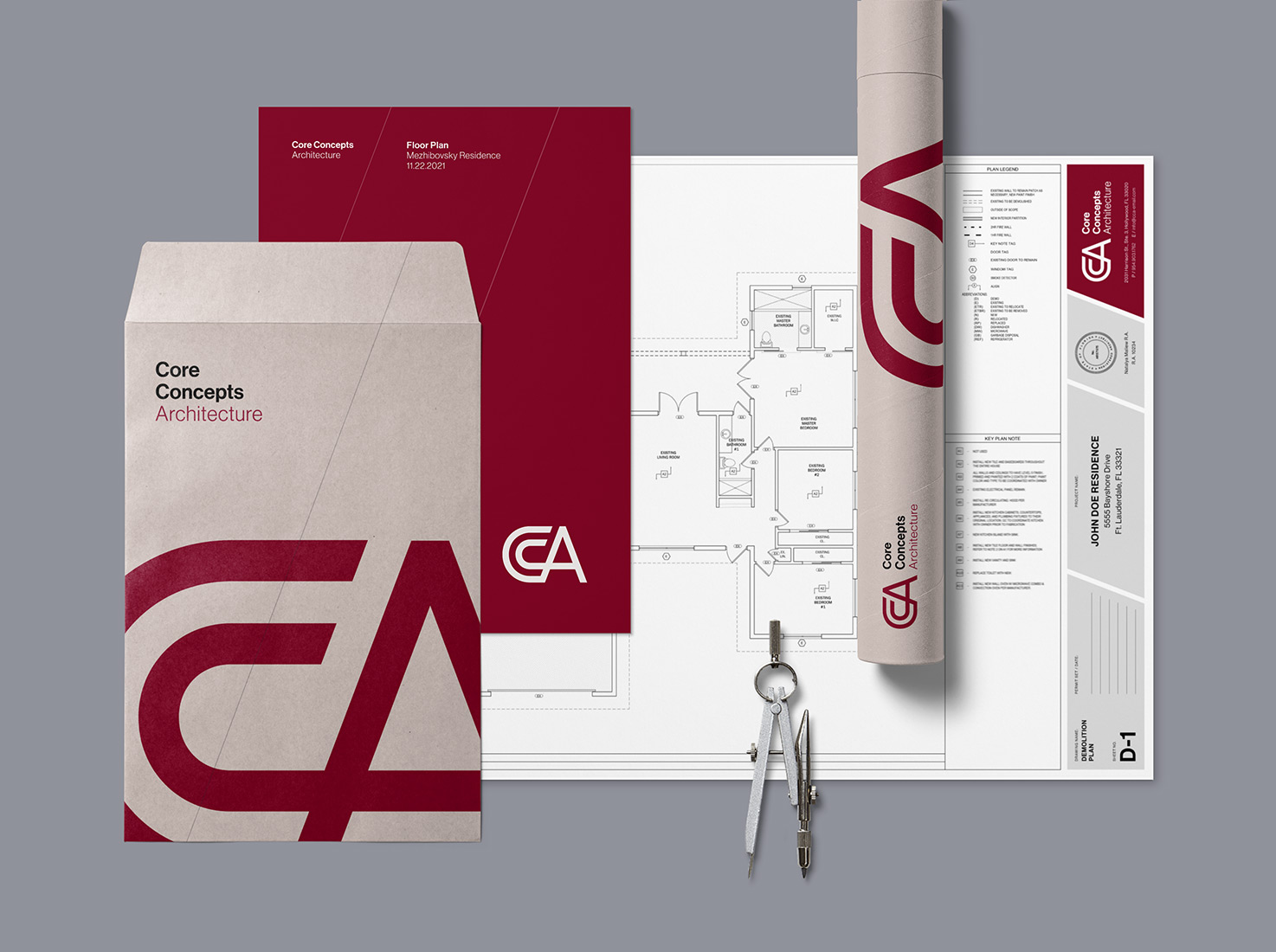
Our collaboration with Core Concepts Architecture went beyond the logo to encompass various marketing materials that carry the same ethos of clarity, sophistication, and timelessness. From business cards to floorplans, each element of the brand identity was meticulously crafted to ensure coherence and a seamless visual experience across all platforms.
The brand identity is a reflection of Core Concepts Architecture’s commitment to not just meeting the expectations of their clients but exceeding them. It’s a mark that they can carry forward with pride, knowing it represents their firm’s values and vision perfectly.
As we look back on this project, we’re reminded of the power of collaboration and the beauty of bringing a vision to life through design. We’re honored to have played a part in Core Concepts Architecture’s journey and excited to see how their new brand identity propels them into the future.